 |
| Art Credit: Alain Moreau |
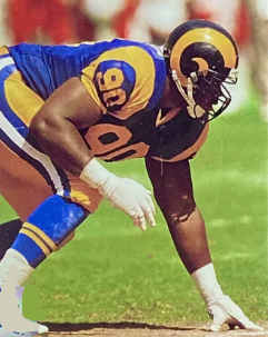
As an eight-time finalist, former Miami guard Bob Kuechenberg has been on the cusp of crossing the threshold to the Pro Football Hall of Fame. In fact, five times he survived the first cut to place in the top 10, including once (the first) when he was chosen as one of six for enshrinement.
But he didn't receive 80 percent of the vote required for election and has fallen short every time since. I know, it happens. But not like this.
Since 1999 -- the year the Pro Football Hall of Fame began releasing voting results -- he's the only player to make the "yes/no" phase and never be elected at some point. All others in that situation eventually won their Gold Jackets in subsequent years. But not "Kooch." He's still waiting.
So what's the problem?
Maybe it's a Miami Dolphins' backlash -- the notion that there were enough members of the early 1970s' Dolphins' dynasty teams already in Canton. Perhaps it was more specific, like a Dolphins' interior line backlash. Three interior offensive linemen -- Jim Langer, Larry Little and Diwght Stephenson -- were inducted from 1987-98 before "Kooch" cracked the Final 15 in 2002.
So maybe voters were worn out.
Or maybe it's something less petty. It's possible some selectors just didn't think he had a Hall-worthy career and could have pointed to the fact that he was named an AP All-Pro once -- in 1978. If that's true, it's shortsighted. There's more to the story of a player's career than his AP All-Pro status, and I'll offer a couple of reasons:
-- First, at one time there were more than just the AP All-Pro teams listed in the NFL's Official Record Book. Another one, the NEA, named the Miami left guard All-Pro in 1975.
-- Second, the late Paul ("Dr. Z") Zimmerman, a longtime Hall-of-Fame voter, chose Kuechenberg to his personal All-Pro team every year from 1972-75. "Bob Kuechenberg," he wrote in December, 1975, "has been the best guard for four years now. Great in every phase of the game."
But there is more.
Kuechenberg was a six-time Pro Bowler, which was the same as Langer and one more than both Little and Stephenson -- the Dolphins' interior trio with busts in Canton. His Pro Bowl total is also the same as Hall-of-Fame guard Joe DeLamielleure and tackle Dan Dierdorf, also a Hall member.
That's the same Joe DeLamielleure who holds Keuchenberg in the highest regard saying, "When I broke in, Kuechenberg was the best in the business, and I modeled my play after him."
He wasn't alone. Add another Hall-of-Famer, former Patriots' guard John Hannah, to the list of Kuechenberg's admirers.
"When I came in the NFL," he said, "I patterned my play after Bob Kuechenberg because he was a great guard. He played on those championship teams and did everything well. His all-around game was what impressed me. He didn't have weaknesses in his game."
But those were players on Kuechenberg's side of the ball. It's what those who played opposite him said that matter more, and the line there is as long as it is impressive. For instance ...
-- Look what Cowboys' all-time great defensive tackle Bob Lilly had to say: "I first played against Kuechenberg in Super Bowl VI, and I realized he was one of the best offensive linemen I had ever seen. Then we played Miami the next year, and he had improved even more. He should be in the Hall."
-- Then there's All-Pro defensive end Bubba Smith: "I played against him my entire career, and he was the best the Dolphins had. People hardly ever had a good game against him. He was the best trap-blocker in the league ... . Gene Upshaw and Larry Little were considered in the forefront because they pulled, but 'Kooch' was the greatest at doing what he did."
-- That "greatest" skill? Trapping. All-Pro defensive tackle Mike Reid of the Cincinnati Bengals, once said that Kuechenberg hit him so hard on one trap block that he "couldn't fall down." That didn't surprise Paul Zimmerman, who called Kuechenberg "the best in the business" as a trapping guard. He loved trap blocking so much that he named his boat "34 trap" after the play that inflicted so much damage to defensive linemen in his 14-year NFL career.
But he excelled at more than just trap blocking, with former Miami offensive line coach Monte Clark calling Kuechenberg "the best short-yardage and goal-line blocker I ever saw. You would have to kill him to beat him."
"On third-and-one," added Miami's Hall-of-Fame running back, Larry Csonka, " 'Kooch' was either going to move somebody or hurt somebody."
OK, so was an outstanding blocker ... short-yardage, goal-line, trapping, you name it. That's been established. But his resume extends beyond that. For instance, he was tough and a winner. How tough? He bedeviled Minnesota's Alan Page in Super Bowl VIII with his arm in a cast that protected a broken arm.
But that's not all.
"One year," said former Miami coach Don Shula, "he even snapped for us with a broken back—while in a full body cast!".
He was a winner, too. Not only was he part of the 17-0 undefeated Dolphins' team in 1972 and the repeating championship team in 1973; over the course of his career, he was a winner 70.7 percent of the time.
I know, football's a team game, right? But the Dolphins' success was based largely on their offensive line. During the 1970s, no team ran for more yards for a higher yards-per-carry average than Miami. Plus, Kuechenberg and his offensive line teammates once blocked for two 1,000-yard rushers (Csonka and Mercury Morris) in the same season.
But that's not all. From 1970-83, the Dolphins' offensive line that Kuechenberg led allowed fewer sacks than any team. Bar none.
" 'Kooch's' skills were especially evident in big games we played," said Shula. " 'Kooch' had, by far, the best won-lost record of any Dolphin player, and that's the bottom line. No Dolphin ever did it better, or as long, as 'Kooch.' "
So what's the holdup to Canton?
It could be that Kuechenberg rubbed some people the wrong way; that he wore out his audience when talking about his blocking prowess. He desperately wanted his legacy cemented in Canton and wasn't shy about telling listeners -- including voters.
"I hate to lobby in this manner," he once told the South Florida Sun-Sentinal, "but what else do I have to do with my time? Who else is around to do it, too?"
He also was the first to uncork champagne when NFL teams on the verge of unbeaten seasons lost for the first time, thus preserving the 17-0 Dolphins' legacy. Plus, there were times after he retired when he was critical of the Dolphins, irritating those players he left behind.
Not exactly the way to win friends and influence people.
"It's another chapter in the grumpy Kuechenberg story," Hall-of-Famer Jason Taylor once commented. "It's Kuechenberg. He gets up every year and bitches about something. If it ain't one thing, it's another. He needs a hug and a hobby. It's ridiculous."
So maybe he had a chip on his shoulder. He should have. He worked his way from someone uncertain that he wanted to play NFL football to an individual whose football fire was relit by Shula when he was signed as free agent in 1970. Then he would go on to play 196 regular-season games and 19 playoff games and establish a legacy that was more than source of pride.
It was ... and is ... Hall-of-Fame worthy. Yet he's not in Canton.
Look, he wasn't perfect. Maybe he was grumpy. Maybe he blew his own horn. On the other hand, it was a pretty good horn to blow, as former Dolphins' owner Joe Robbie pointed out.
"If I ever get to build my own stadium down here," he said, "the first thing I am going to do is erect a statue of 'Kooch' in front of it. More than any player, he symbolizes what the Dolphins 'together we win' program is all about."
That never happened, but it should have. Robbie sold the team, Dan Marino arrived and, with the charismatic Hall-of-Fame quarterback becoming the face of the franchise, it was he, not an offensive lineman, who had a statue erected in front of the stadium. Nevertheless, Robbie's comment symbolizes how important Kuechenberg was to Miami's success.
So does another accolade, this one by Shula.
"Bob Kuechenberg contributed more to help my team win than any player I've ever coached," he said. "Wherever the team needed him— that's where he played. Whether guard, tackle, center or long snapping ... 'Kooch' dominated defensive linemen at both guard and tackle. Wherever we put him, any threat we faced from the opposition virtually disappeared. He certainly deserves to be in the Hall of Fame."
Hopefully, the Hall's seniors committee takes note and affords an offensive lineman who may have been the NFL's best trap blocker ever something he deserves -- one more shot at Canton.